Positioning layers
KB14415
The positioning layers on the canvas is very flexible indeed. As we are working with a responsive design platform text layers are either left aligned, right aligned, or centered in the available content area. Layers such as the logo or media can be given a left or right offset to the outer margins for better placement on the page.
The system does not take into account the widths of text layers set in the design tool - this is purely for visual aid only. The widths adhere to the Bootstrap 3.3 grid system and are based on device that is being used to view.
Some templates have a separate layout for the home page and content page.
Fixed and Relative Positioning.
Layers can be fixed vertically thereby not scrolling when the page is scrolled. The layers will still adhere to the horizontal positioning rules.
 Layer will adapt to screen
 Layer is vertically fixed on page
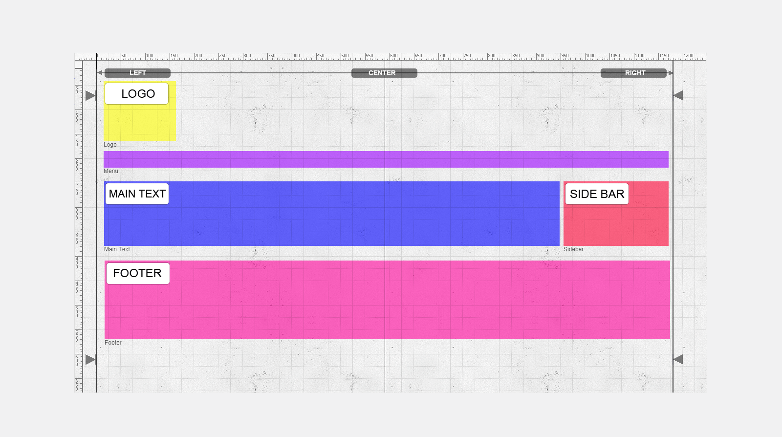
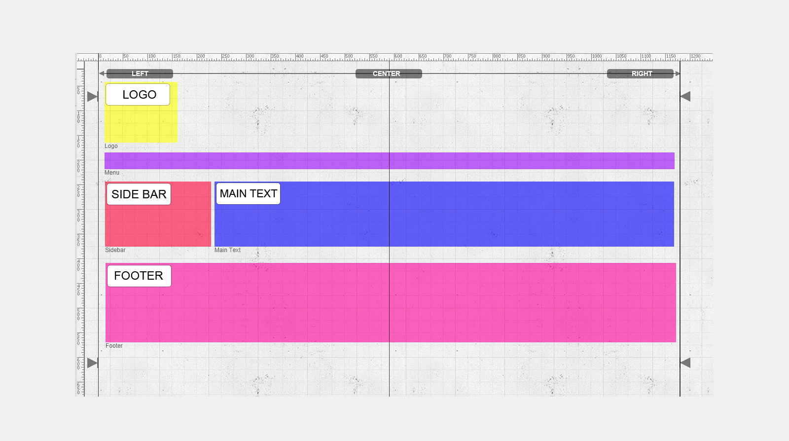
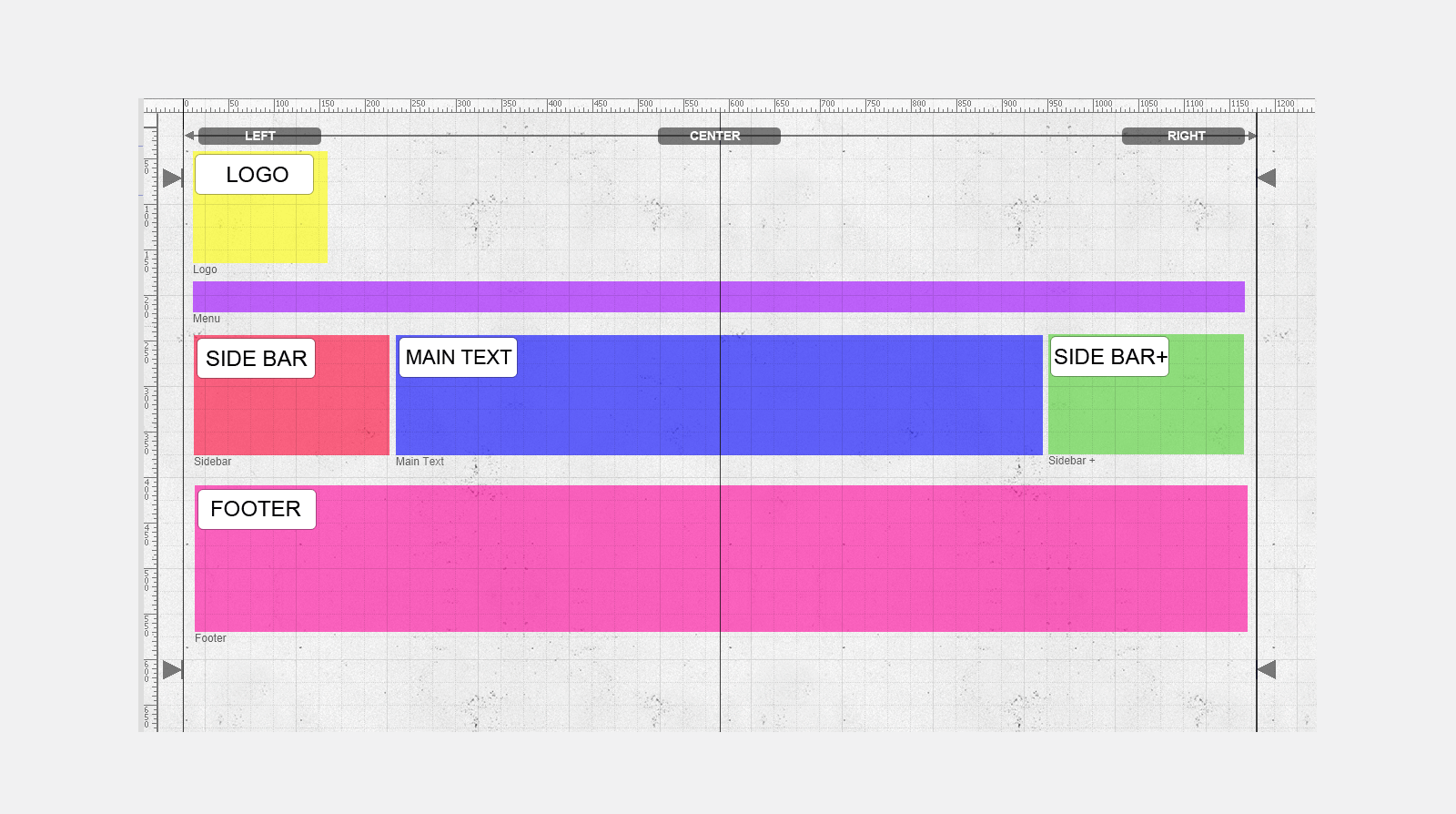
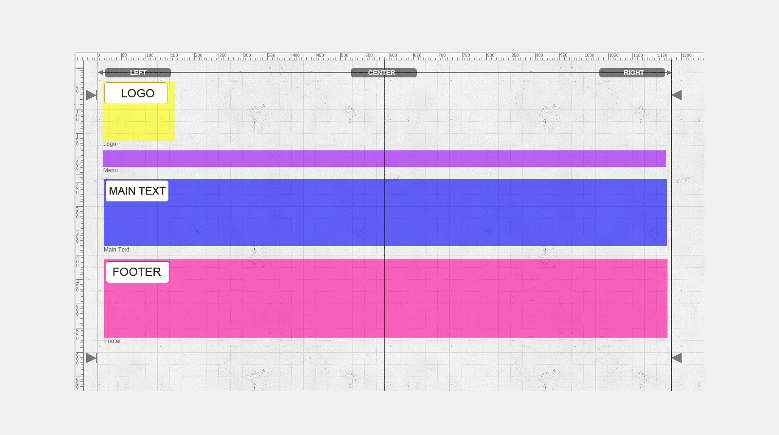
Some examples...
The main text is to the left of the page with side bar column on the right.
The main text is to the right of the page with side bar column on the left
The main text is centered to the page and one sidebar to the left and one sidebar to the right.
Just centered main text only - sidebars are disabled.
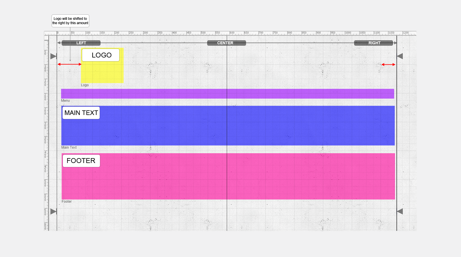
The logo is moved slightly to the right to better fit the design
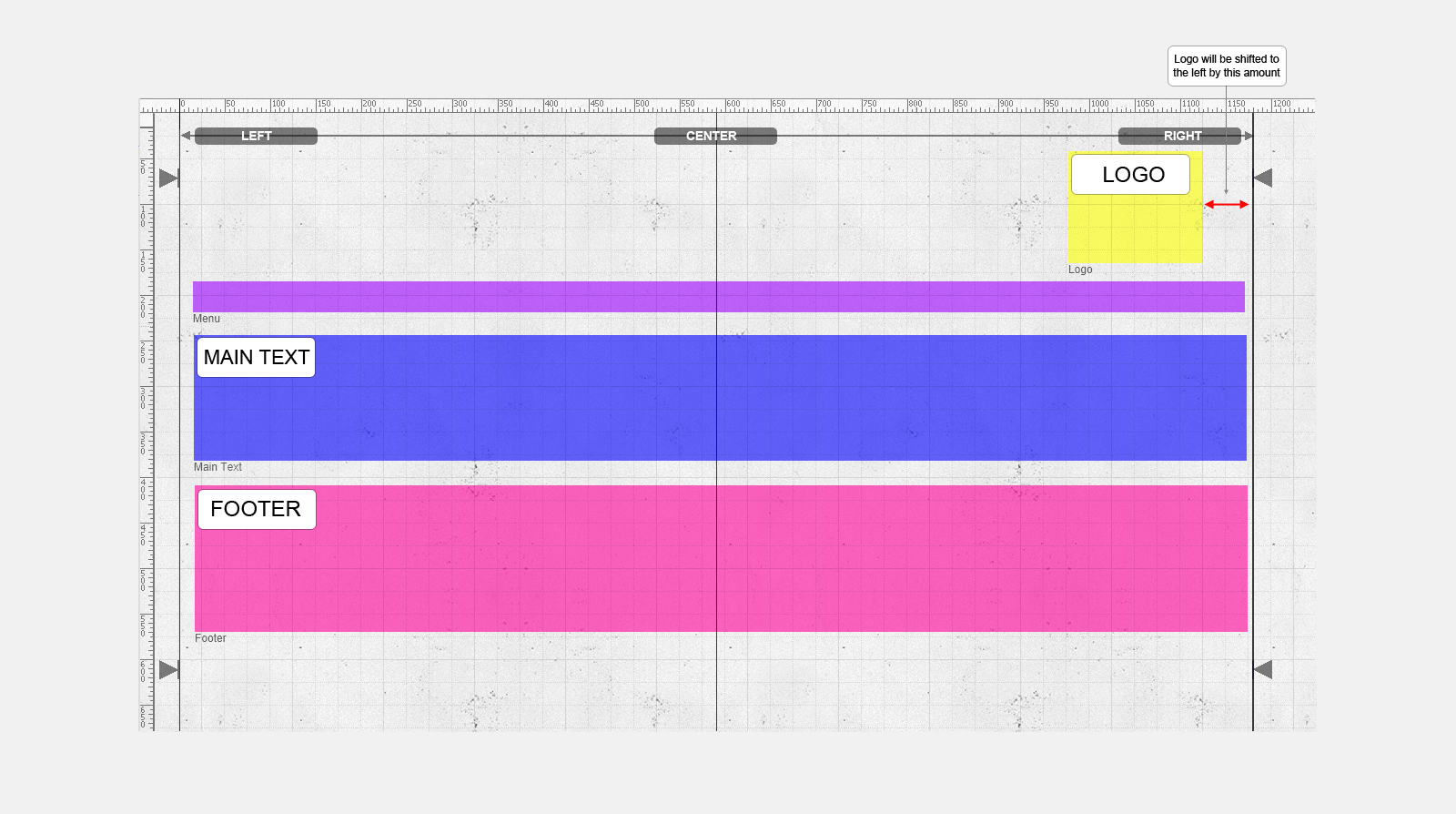
The logo is right adjusted with a slight offset to the centre of the page to better fit the design.
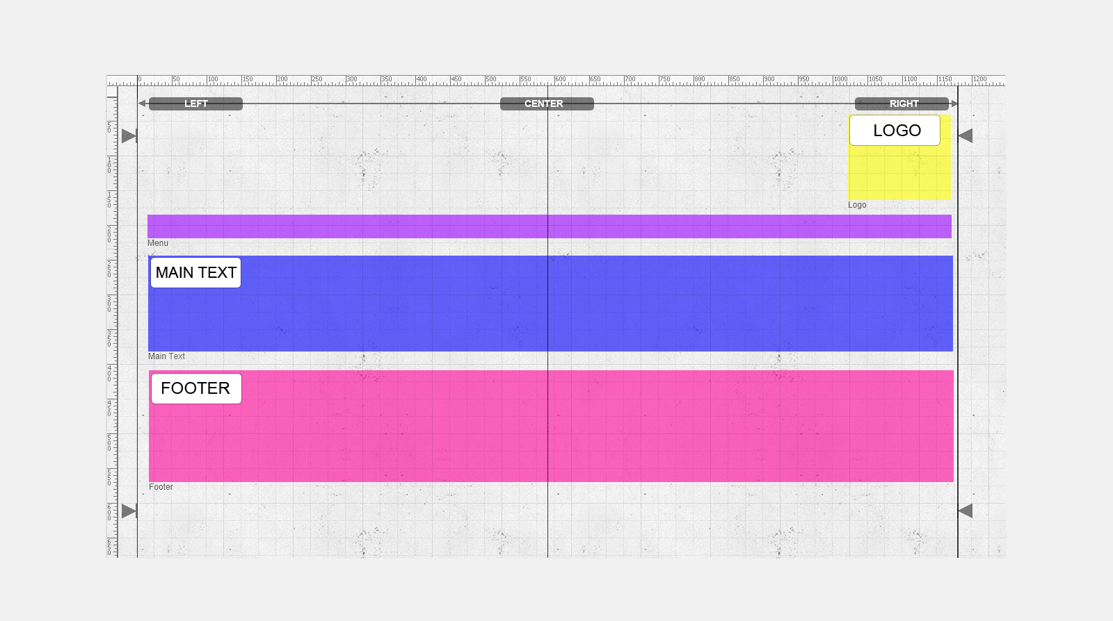
The logo is right adjusted with no offset.
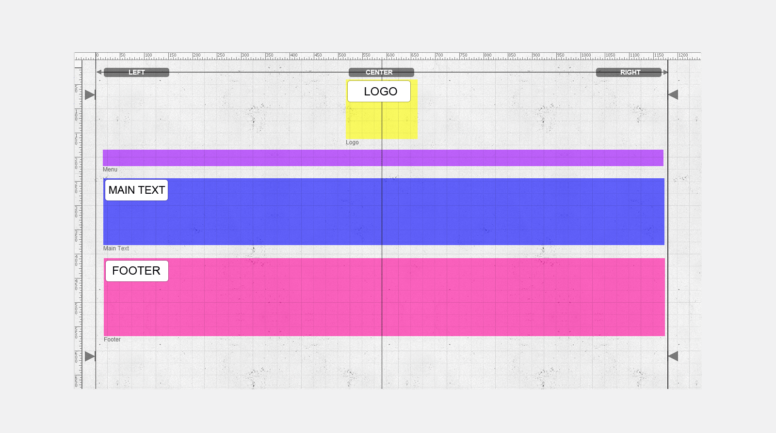
The logo is center adjusted. As long as the left side of the logo is in the left side of the canvas and the right side of the logo box is in the right side of the canvas the logo will be automatically centered.
Updated on: 07/10/2015 12:54:54